Skip navigation links

Visual Expression

Our visual expression makes the MSU brand more memorable and meaningful.

A consistent visual identity creates a distinctive look that becomes recognizable and credible when repeated in communications over time.

MSU’s visual identity focuses on four key areas:

  • Typography
  • Color
  • Graphic elements
  • Photographic style

These design components may be used flexibly. Choose and use the elements that work best for your audiences and communications.
Font-graph-visual-page

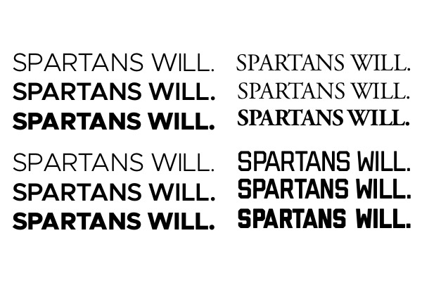
Typography

Typography choices say a lot about an organization. Our primary and secondary typefaces have been chosen to convey both the optimistic, forward-thinking tone of the university as well as to connect to our history of excellence and impact.

To obtain brand fonts, register the name of the unit and individual user at comms.contact@msu.edu or call 517-355-7505.

Read More

Color

Green and white are recognized as Michigan State’s official university colors, and Spartan green is iconic. It provides an immediate and powerful emotional connection to the university and to our proud history and uncommon will to empower an extraordinary future. Think “Go Green!”

Read More
Color palette
Graphics

Graphic Elements

Graphic elements bring impact and consistency to design and photographic style in MSU communications. These visual elements are available to help units express their identity as a part of MSU in a way that is immediately recognizable.

Read More

Photographic Style

Photography is a vital element of the MSU brand. It evokes emotion and connects people to the university. Our photography should be beautiful but also authentic and relatable, reflecting our pursuit of excellence for the common good and our welcoming, inclusive community.

Read More
Examples of MSU photography